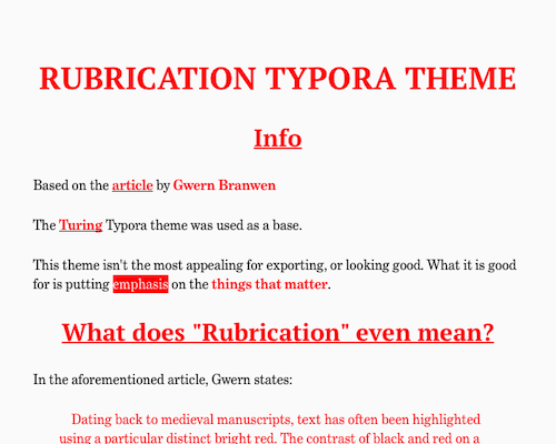
Rubrication
Rubrication
Info
Based on the article by Gwern Branwen
The Turing Typora theme was used as a base.
This theme isn’t the most appealing for exporting, or looking good. What it is good for is putting ==emphasis== on the things that matter.
##
What does “Rubrication” even mean?
In the aforementioned article, Gwern states:
Dating back to medieval manuscripts, text has often been highlighted using a particular distinct bright red. The contrast of black and red on a white background is highly visible and striking, and this has been reused many times, in a way which I have not noticed for other colors. I call these uses rubrication and collate examples I have noticed from many time periods. This design pattern does not seem to have a widely-accepted name or be commonly discussed, so I propose extending the term “rubrication” to all instances of this pattern, not merely religious texts.
Why this rubrication design pattern? Why red, specifically, and not, say, orange or purple? Is it just a historical accident? Cross-cultural research suggests that for humans, red may be intrinsically more noticeable & has a higher contrast with black, explaining its perennial appeal as a design pattern.
Regardless, it is a beautiful design pattern which has been used in many interesting ways over the millennia, and perhaps may inspire the reader.
Essentially, Rubrication is a way to draw attention to the important stuff on the page. This makes it a good tool for note taking, as you can cut through the fluff and find what you need.
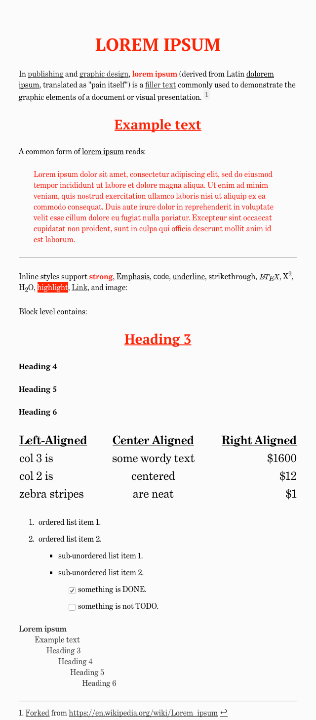
Screenshot: